Post A Picture Of Mine That You Like But List The Discrepancies
the only reason how i became talented in art was by people judging it and telling me how awful it was by comparison, so i proved them wrong by constantly upgrading my art style. but i need that fire to keep burning so go ahead and take a shot at me.
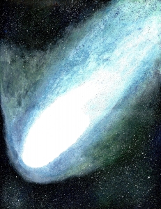
The white in the comet is "blown" (overexposed) if you photographed a painting. The white in the comet's head is featureless. Likewise for the tablecloth in the Green Grass Cup. Unless you've purposely tried to kill the "rule", your tonal range is blown in the highlights. I think the works would be better if they had a full tonal range. If it is a digital image, then this is easily changed. If it is a photo of a painting, you need to work on your photography.
this won't print here, it has a poor presentation. you'll need to find a way to shoot these and make them look good. for now, get a clean space of counter. but the thing is, the gimmick is the folded card, its lost in this format. you need keywords and descriptions for these. if you don't advertise, no one will find them.
same with this - don't offer it for sale.
i'm not understanding why your putting these on folded papers. try not to go so close to the edge
the problem here is - people might frame this. and they can't fold it to make the effect you want. when you use levels, don't use the white eye dropper on the background, or all the whites will blow out. use the grey one, which only does the color tint. i would honestly try to draw these where you didn't need a gimmick to view them. because it loses its effect when you can't fold it. you'll want to sign these. be sure your filling the tags out right. your putting a description in there, when you should be adding a list of words there.