i rated the first one by mail

this is a very pretty shot, but i would remove the towers on the right

however many of these images don't suggest where you are. this can be any place. this image is just a brown building. there isn't anything particularly interesting about it.

the only thing in here that says where you are, is that chunk of building on the left. it would look better if you could have gotten more of that building. that one building on the right, doesn't fit into the comp.

this is tilting, and again, this can be anywhere. i'd get out of the parking lot though, the cars don't add much. they may a 100 years from now, but as art it falls into the snapshot category.

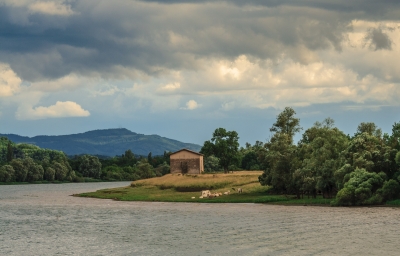
this kind of shot says france to me more. though... i would not use that sepia wash. makes it look dull.

the tags don't mention grapes at all. the field is good, the sky is boring. i'd have more crops, maybe from a lower angle.

i guess this is the tighter version of the one you sent me. i'd rather see more of the land on the left. a zoom in the camera is what meant. now the image is smaller. the brightness does help, but its tilted.

this leans a bit as well. i'm not sure why there is a wash on this. the tint doesn't make it work better. it reduces contrast and colors. as a composition, its not really that interesting.
---Mike Savad
MikeSavad.com