Looking for design inspiration? Browse our curated collections!
8 Years Ago
People were starting to get lost in the "Big Skip" so here is Work in Progress 2015 Thread #2
I personally love seeing artwork come together. Please share your works in progress here.
Please if you'd like, add a short description, techniques, colours, computer programs, tools used etc.
-All types of Artwork Welcome- As long as its in the "creating" stages and a - work in progress-
Reply Order
8 Years Ago
With the loss of my "golden girl" I have found it difficult to complete this oil. I just did a little work on it over the weekend, but had to put it away for another day.
8 Years Ago
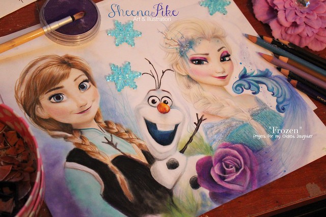
She's Complete! Pretty proud of this little gal...Loving this Collection of mine. Hope everyone is enjoying the summer I have been working on my Fairy gardens and am obsessed with them now! My oldest daughter and I have been adding and adding to them. Take care everyone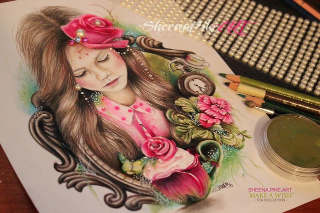
8 Years Ago
This is a WIP of a patten I'm working on using Adobe Illustrator with my Wacom Cintiq HD22, all the elements are drawn by hand using a "pen." The next step is to colorize it, then create the repeating patten. I love using the Cintiq, 1000x better than trying to draw using my mouse!
Sheena, I love your artwork!
8 Years Ago
Sheena I'm just going to come out of "lurk" mode to let you know how much I love your work.
8 Years Ago
Sharon so cool love seeing different styles and medias of artwork on the thread. I have a Wacom and am still trying to get a feel for it. Thanks so much for joining the thread please continue to post Very neat!
Cheri Your avatar is captivating, just beautiful!........Thanks so much for saying that and stopping in, your too kind.
Your work is LOVELY.....much love and respect to you and your creations.
8 Years Ago
I've done a LOT of work on this piece since I posted a fragment of it on the other thread. Just to let you know. Thanks, Sheena!
8 Years Ago
Sharon It makes so much more of a difference with color looks great thank for sharing the finished image.
Hey JL! I saw it on the other thread I commented on how much detail...so much detail......thank you for continuing to post your beautiful work.......very powerful.
Loving that people are participating had trouble getting people to participate in my threads in the past not sure if its because I'm an outsider or just that work in progress isn't something people are interested in sharing so thank you to everyone who shares here! I'm slowly starting to get people to respond and join and am loving it! THANK YOU
I promise I don't bite ;)
8 Years Ago
As always very very nice artwork Sheena! :) Here is my latest I'm working on...
Still have yet to finish, I'm working on deepening colors and then on to the details and finishing touches!
8 Years Ago
Love your work Sheena.
This is a work in progress of my Son standing in front of a mountain of rocks in Montana. Waterfall are trickling down behind him.
This is at the ugly stage, only started the rock layers.
I toned the canvas with grey acrylic first.
Then sketched my lines over that with white conte' chalk.
I also put lines on my photo to separate the canvas into 6 sections to get the proportions correct.
The size is 24" x 20", oil.
8 Years Ago
Tomorrow I will work on the Gt Dane and Gentleman.... May even have this finished tomorrow evening all going well. It is a Fathers Day gift and, if I can get it done, then it should be dry for the Thursday before. I am doing it in a faded to white background due to the canvas size. This will make it appear more elongated and less dark. The two characters will stand out more a they are both quite dark colours when done.
8 Years Ago
I created blog posts for my current WIP, I'm currently on update #4
http://davidkingstudio.blogspot.com/2015/06/passed-its-hay-day-wip-4.html
David King
http://davidkingstudio.com
8 Years Ago
Thank so much Monsieur! and thank you for joining in on my thread I am really enjoying the use of color you have in your Art! WONDERFUL and Bright
Gay Thank you So very much! I think your painting of your son is coming along nicely! I have a deep admiration for painters since I use dry media and am not a painter....much respect to your talent and the blending and layers required to create depth! and All those rocks (so awesome) I wouldn't have the patience or attention span for it!
Abbie So awesome to see you here! Thank you for sharing....your a story teller with your work!
Drew always a pleasure.....when I see your work I always know who its by! Very unique and original.
8 Years Ago
Thanks again gay you are too Kind! Much love and respect to you and your talent
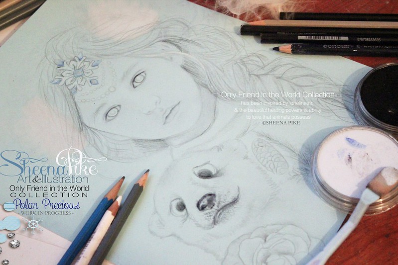
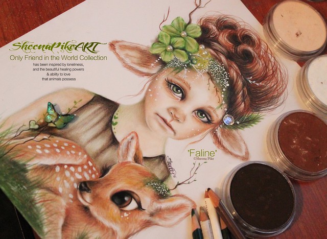
"Faline" is Complete......really loving this Collection
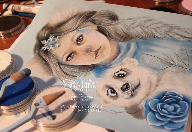
-----------Only Friend in the World Collection------------
has been inspired by loneliness, and the beautiful healing powers & ability to love that animals possess
8 Years Ago
Monsieur Loving the colors.....thank you for participating in my thread!
Donna Thank you!
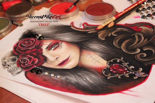
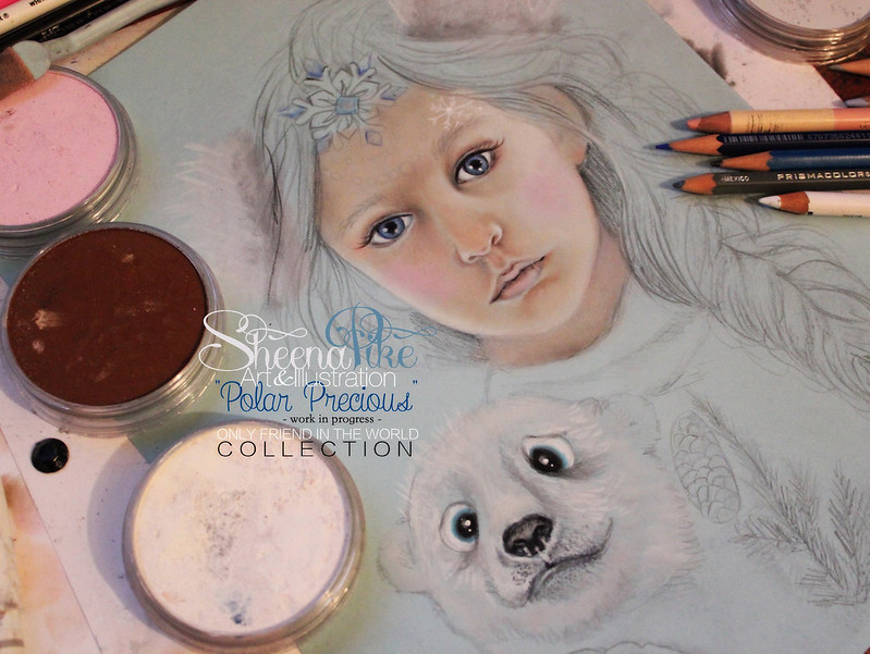
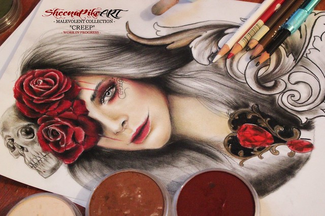
Current project....have been neglecting my "dark art" fans..... it's been such a bright happy summer that I haven't been in the mood for my dark work lately but dug deep tonight and was able to get inspired
8 Years Ago
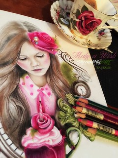
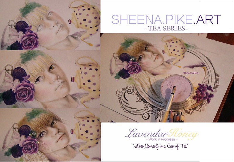
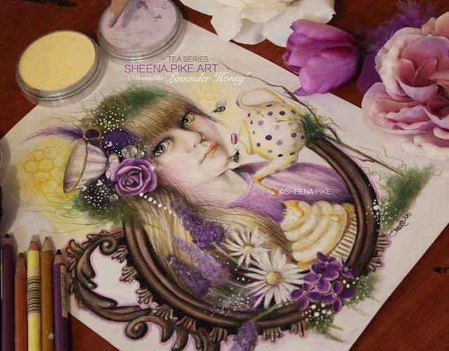
I've got one child off to Grandma and Grandpas for a sleepover & the other is napping so this Mama got some work done today!
I must say I am pretty proud of this little gal.....My Tea Series brings something out in me and my art....I can't explain it but I will always hold this series close to my heart.......it has transformed me as an artist.
Much Love....
"Never Strive for Ordinary"
Sheena Pike Art
WEBSITE: http://sheenapikeart.wix.com/sheenapikeart
TEA SERIES �Sheena Pike - Sheena Pike Art
PanPastel Colors- Faber Castell - Prismacolor Pencils - white ink
"Lavender Honey"
8 Years Ago
Where is everyone!?....Anyone working on anything new?
Did this cool little guy today....
8 Years Ago
HELLLOO OOO OO O ........ theres an echo in here! Where are all you hard working artists!? Miss you guys!
8 Years Ago
I've been creating artwork for the BBC costume drama Poldark, I like 18th century costumes and architecture. This is an initial sketch of Trenwith, Cornwall the estate of Ross Poldark's uncle the older Poldark son. The house is actually Chavenage House in Gloucestershire, UK. At this point I wasn't sure how I would color it, I'm kind of new at drawing and wing it as I go along. I like digital layers programs because I can easily delete colors or brushstrokes I don't like.
I kept adding paint until I liked it. At this point I'm not that familiar with all the brushes and the texture they create so I added a texture for more interest. I tried to make my brush size smaller for the linework, next time I will make it even smaller to get more detail in.
I try to use the image again in a different way if I can. I like the colors the Difference mode creates with textures, often it is too dark so i can't use it but sometimes it works out. I added gold and blue paint to this image or I take colors out and substitute others, posterizing first makes this simpler. I used two different brushes for the stars and variance. I painted behind the word Poldark to amp the dreamy look.
I love everyone's art, great job! Sheena I really like your avatar it is like your painting, very cool! The images of your work process are well done and colorful.
8 Years Ago
Monsieur! Awe Thanks, Hope you are doing well!
Suzanne! That is so neat seeing it come together thanks so much for sharing here on my thread. I Love seeing all kinds of work come together. Love your color choices Both are Awesome in their own ways.....
Oh! and Thanks Suzanne I am getting ready for another Magazine Article so needed to update my Bio pics....sprucing things up a bit!
8 Years Ago
Congratulations Sheena! You are moving forward, I see more color and detail in your work and a new subject, plus your photography is magazine worthy!
8 Years Ago
Hi again, Sheena. I really like that bluebird!
I'm still working on the jungle picture. Still a ways to go. Sometimes it feels like it's holding me hostage. :P
8 Years Ago
Hi Sheena
This is my beginnings of a Wolf portrait. What will hopefully become part of my new Wildlife series. Still lots to do... but a start nonetheless. Am enjoying my new pastel pencils :)
8 Years Ago
Caroline! Wow looks wonderful.....the fur texture looks great! Fur is so time consuming! Thank you for sharing
8 Years Ago
Thanks Sheena! Yes, it certainly is. I think this one is going to take me a while to finish... :)
8 Years Ago
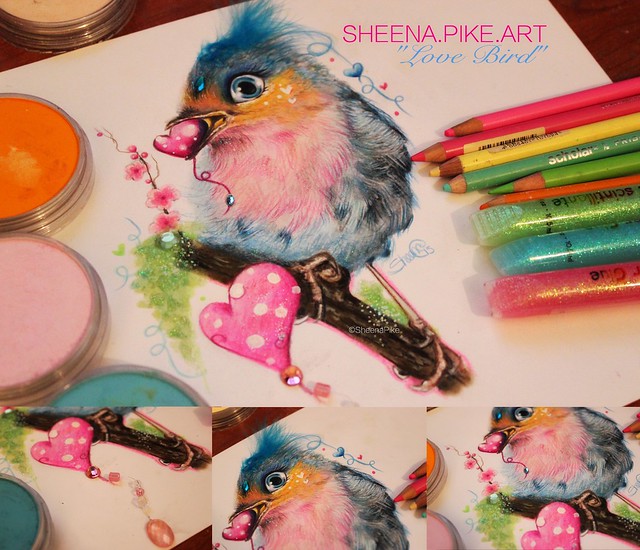
JL I totally get that I have had a few drawings I have stepped away from just because I felt a prisoner to it....had to clear my mind in order to continue. Oh and Thanks the bird was just a fun little thing I did while my kids were napping...trying to play around with some illustration and a little different style than I am used to. Hoping to get more practice with illustration and cartoon like art in the future.
Monsieur thats wonderful thank you for sharing!
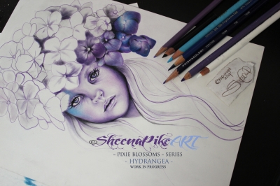
Was able to get some work done today, while my youngest napped. Fun afternoon with my oldest daughter doing art with mommy today.
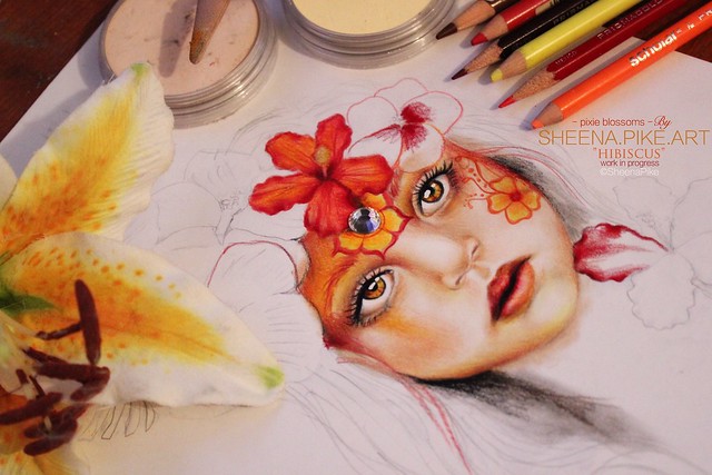
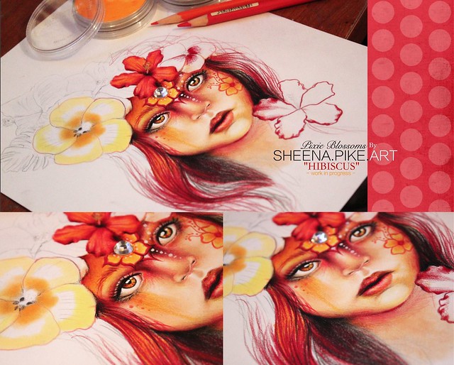
Was working on writing my Magazine article and was having a bit of writers block so decided to take a break and work on this Pixie Blossom.
Take care everyone!
8 Years Ago
'Sunset at the Beach House' is an oil painting based on a photograph I took in La Jolla, California. It's a beautiful place to visit.
I hope to complete the work sometime this week. This is my first painting where the title preceeded the work. Generally I give my artwork titles after the paintings are finished.
I'm pretty happy with it so far. I think I'm capturing the 'California glow'.
8 Years Ago
WIP #1: Diarmuid
This is the first work in progress update of my latest commission. The drawing is of my friend�s 4 year old son, Diarmuid, and the photograph used is his school portrait. In this first update, I have drawn his face, but as I complete other sections of the drawing, I will continually adjust and enhance details of his face to make the drawing balance well.
http://www.conorobrienart.com/wip-1-diarmuid/
--------------------------------
Conor O'Brien
www.ConorOBrienArt.com
8 Years Ago
Incredible work Conor thank you for sharing here. Would love to see it when its finished too.
My Magazine Article in October inspired me to do another small demo clip....plan to do many more videos. Decided to keep this one short and quick
8 Years Ago
This is a photo I took at my local garden center I wanted to make it look more like an abstract painting. Although the end result didn't turn out to be very abstract as I gain confidence in the technique I will have more control over the results. I smudged the photo and painted some pink color in at the bottom and made some minor changes. The smudge can be set from little to a lot, the more smudge the more abstract the image becomes.
Next time I will try more smudge and paint for even more of an abstract look. The only problem is when painting an image in the regular mode the paint texture is very different than the photo surface, the texture difference is very obvious when printed.
The way around that I have found by putting the painting layer in hard light, the texture of the paint and the photo print surface will match. The only thing about this is painting in hard light makes the paint not opaque and is translucent which makes it hard to cover lines in the photo image.
8 Years Ago
WIP #3: Diarmuid
I�ve had a very busy week, but eventually found a few hours to make some progress in my latest commission, Diarmuid. I completed half of his jumper, which really starts to balance the drawing through the nice contrast with his lighter toned face.
http://www.conorobrienart.com/wip-3-diarmuid/
--------------------------------
Conor O'Brien
www.ConorOBrienArt.com
8 Years Ago
Here is the sunflower photo I took at the Garden Center. I put textures on it for now because I need to fill space as I learn to paint. I ended up painting over almost all the texture and changed colors. I re-positioned the flower not wanting it in the center of the image.
8 Years Ago
Suzanne, Conor Danl ! Awesome thank you for sharing.
Suzanne Sunflower Burst "Tangerine" is awesome and so warm, Love it!
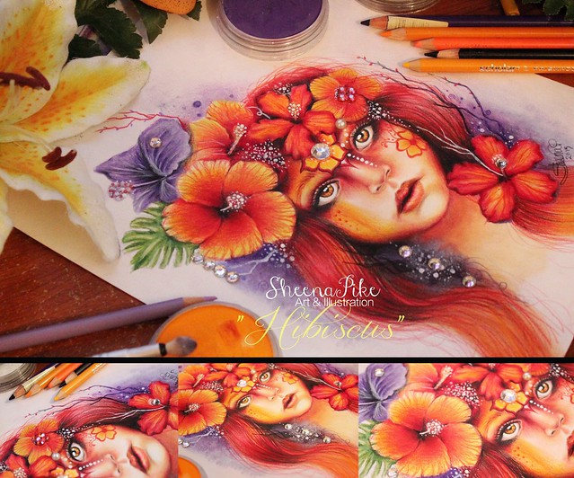
Hibiscus is Complete.......
8 Years Ago
Thank you Sheena, always like adding to your post, you are very encouraging, always commenting to everyone! I am a little disappointed with the appearance of this image because of FAA sharpening. Love your Hibiscus (also your mice and birds), you also have a beautiful warm image! I am always amazed at how smooth your colors and shading turns out. I know you put your heart and soul into your work and it shows.
8 Years Ago
Thanks Suzanne and Thank you for sharing in my thread I really appreciate it. When I first came to FAA I rarely could get anyone to engage with me since I was the new kid on the block.....it's nice my thread is staying alive and active. Please continue to share. always a pleasure you and your artwork.
My latest.....
8 Years Ago
I thought maybe if I post this, I'll finish it before the end of the year! I still have lots to do...detail work to finish up on the leaves and stems, more shading, and adding some texture and vignette.
Sheena, you're work keeps getting better and better...love it!
Suzanne, love your bright orange sunflower painting!
8 Years Ago
Sharon thanks for sharing ...can never go wrong with pink flowers.....this is sweet and delicate.
And thank you!
8 Years Ago
Thank you Sheena, always nice to post here.
Lovely Sharon I assume it is a painting done by hand, I would state that some may not be familiar with Cintique so people can appreciate your hard work.
Like your style Danl!
8 Years Ago
Hey guys! I've had Horrible Artists block but last night it snowed and gave me the inspiration I needed.....so I am back to it....
Awesome DanI!
Just finished up with Colored Pencil Magazine now Preparing for my interview with PanPastel Company that will be adding me to their "Artists" list....pretty excited and Grateful.
Heres a Drawing I am doing just for fun for my Daughter as a gift for Christmas.
8 Years Ago
Thank you for sharing Win it's nice to see all this diversity on the thread...all different styles and techniques.
it''s Snowing A LOT right now.....so perfect inspiration for my current drawing....
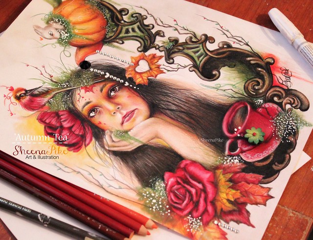
This collection is pushing me to take my skills further by applying animal like characteristics/features to the portraits while maintaining the original subjects features......I'm approaching this as if I am "face painting" the portrait once its drawn.......having so much fun applying illustrative details and style.....
-----------Only Friend in the World Collection------------
has been inspired by loneliness, and the beautiful healing powers & ability to love that animals possess
8 Years Ago
Thanks Danl Art for continuing to share. Warms Wishes to you this Holiday Season. <br> <br>MERRY CHRISTMAS EVERYONE! <br><a data-flickr-embed="true" href="https://www.flickr.com/photos/sheenapikeart/23670774292/in/dateposted-public/" title="Seasons Greetings Sheena Pike Art & Illustration"><img src="https://farm6.staticflickr.com/5682/23670774292_90a2b12607_c.jpg" width="800" height="314" alt="Seasons Greetings Sheena Pike Art & Illustration"></a><script async src="//embedr.flickr.com/assets/client-code.js" charset="utf-8"></script>