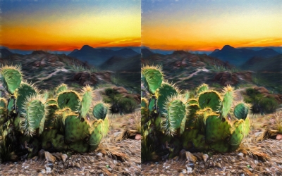
I would say the left one - but - it would be easier to decide if there were about 5 spaces between them. I simply blocked off one, then the other with a piece of paper.
i like the left, but would rather see the one between those 2. the first one catches the eye better, but looks artificially sweet. the one on the right looks more natural, but a bit dull. so some where in the middle.
thanks... all... the version on the left simply has a duplicate layer set to multiply so I can change the opacity on it and blend it in... and I agree the cactuses seem just a little nicer on the right... I actually didn't see it until I posted the side by side... they are just a little fuller... golden... richer...