Looking for design inspiration?   Browse our curated collections!

Return to Main Discussion Page
Discussion Quote Icon

Discussion

Main Menu | Search Discussions

Search Discussions


Laurette Escobar

9 Years Ago

New Photo

Sooooooo what'cha think?

Reply Order

Post Reply
 

Laurette Escobar

9 Years Ago

is it that bad????? lol


Mike Savad

9 Years Ago

do you want a critique? or what do you want to know?


---Mike Savad
MikeSavad.com


Mike Savad

9 Years Ago

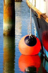
up close the aberrations are a bit strong. and i think it's saturated it a little too much. it's also a bit tight, while the pole has nice colors, it competes for attention as does the one in the back. there is no description, no tags and not much of a title. no one will find this.


---Mike Savad
MikeSavad.com


Laurette Escobar

9 Years Ago

Oh I didn't have time to tag.....but yes I wanted a critique of the photo and thank you. :)


Mike Savad

9 Years Ago

ok, because if you don't mention it, people will skip over it. but do tag it and such because its hidden. and better titles.


---Mike Savad
MikeSavad.com


Laurette Escobar

9 Years Ago

Gotcha....


Edward Fielding

9 Years Ago

Wish I had time. I have a bunch of images to tag. ;-)


Laurette Escobar

9 Years Ago

I know tagging is a chore.


Rich Franco

9 Years Ago

Laurette,

Nice image. I think that the saturation/contrast can be pulled back, the white on the boat looks very white and may be blown out or close to it. I would also like to see a horizontal version, with more water, if you have one,

Rich


Edward Fielding

9 Years Ago

Here is similar one that just sold - http://fineartamerica.com/featured/buoys-gina-jackson.html


Laurette Escobar

9 Years Ago

It's a beauty! I like her work.


I know people have a thing about saturation but for me....more color the better. I'm a color person....gimmie color!!!! But I do appreciate y'all's input though.


This discussion is closed.