Looking for design inspiration? Browse our curated collections!
9 Years Ago
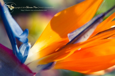
. . ★ . . :: Let's talk about White Balance . . you are welcome to add your thoughts and share your process in a comment below . .
I always shoot in RAW . post production in photoshop and/or lightroom to reveal the colours will help tremendously . .
Use a very subtle super light touch when processing your images making adjustments to your temperature and tint to maintain natural colours unless you are going for a more creative approach .
About colours . .
Adjust your hues using your slider on the HSL / Grayscale for a creative split-tone effect which often is effective for brightening colours . .
Adjust Luminance on specific colours to brighten or deepen colours as well as to add depth and dimension to the image . .
I almost never touch saturation . . if you do . take care to not saturate too much when you are trying to maintain a more natural appearance to your final image . .
Vibrancy is also something you would want to be very careful with as it will flatten your image . .
Black and White is a wonderful choice to "save" an image which has turned out to be overall flat . . .
Mostly focus on White Balance / Hue / Luminance and Curves . . .
Then if you like you could make adjustments in Split Toning for more creative expression . . .
White balance is so important in all circumstances . especially in low light conditions . ie. overcast "grey" skies . . Yet in all light conditions it is so important . .
Light is the key for beautiful photography and when the sun is not cooperating you must meter correctly for the lower light conditions (using a tripod helps tremendously)
You may make post production changes for your white balance to adjust your colour casts by making adjustments in temperature and tint .
Many images have a colour cast and you can solve this issue by adjusting your white balance . . especially when you have a very cool colours with winter skies or shadows . you may warm them up a bit and brighten them by adjusting your temperature and tint . .
For in-camera white balance options your DLSR has presets and Auto is much too unpredictable . . . basically an auto setting on your camera is your camera telling you what colour white is . .
You want to tell your camera what white is . . When shooting outdoors or especially indoors setting your white balance is important . .
For your camera settings try selecting your camera White Balance mode on Shade or Cloudy to warm things up a bit . .
You may choose to create your own white balance preset . . .
Then make adjustments in photoshop and/or Lightroom to your white balance by adjusting the temperature | tine | highlights | midtones and shadows . .
Use Parametric on your Tone Curve to make adjustments then also use Point . play with it until you like the results . .
Always remember never to touch your original images . . only process copies of your work to preserve the integrity of your portfolio .
That is one of the things I really love about Adobe Photoshop and Lightroom . . there is no photo degradation . .
You can make endless copies of your work with many variations for your final images . . .
In Photoshop for Curves you may choose on your drop-down tab Medium Contrast | Strong Contrast | Linear . . or Custom . .
Slide your points and adjust the curves until you like what you see . . .
Lower your contrast and adjust the blacks and/or clarity to soften an image . .
You may choose to use a vignette to create an interesting effect for focusing the eye on the light within your image . .
Create your own presets . . . they are a tremendous resource you may custom create to save yourself time in your work flow . .
Using lens filters will help as well in all light conditions . . . . .
These are only a few suggestions to help you . . . .
I shoot in RAW . often use lens filters and tripod . . try to get everything as perfect as possible in-camera when I initially take the photograph . . then post-process in Adobe Photoshop CS5 Extended and finish my images in Adobe Lightroom 5.5 :: . . ★ . .
Reply Order
9 Years Ago
I think you are overcomplicating it. WB is about the colour of the light when you took the photo. If you adjust the colour temperature to match that of the ambient light then you will have the right WB.
You might want to adjust the hue, saturation, etc. for additional aesthetic effect but that isn't a WB issue.
In the old days, colour film was generally adjusted for the WB of daylight and most people thought nothing more about it.
9 Years Ago
Back in the film days you bought "Daylight" balanced or "Indoor" balanced film. If you used outside film inside, your goose was cooked because all of your shots would have a yellow tinge from the tungsen light.
Now with digital I just set my camera to AUTO white balance and it does a great job adjusting for the light most of the time. I shoot RAW so the WB isn't cooked into the shot like it would be in a JPG. Any problems are easy to fix in Lightroom.
To be safe you can get color correction cards. You shoot a frame of these cards and then use one of the eye droppers in Lightroom to pick your white, black or grey tone. And then the WB is perfect.
9 Years Ago
Be careful about saying no "photo degradation" in Photoshop. There are ways you can degrade the original. Always work from a copy.
Lightroom works differently than Photoshop.
9 Years Ago
Your goose wasn't cooked if you had an 81A filter, Edward. :)
But, like I said, most people didn't get into that stuff.
And RAW is the way to go today, the ability to click on a white object in the image will sort out WB issues, nine times out of ten.
9 Years Ago
Yes, WB is important. But as already said, this does seem an over complication. I shoot RAW, leave it on AWB and set it with the eyedropper in Lightroom if its off.
Color correction, the rare times I've found a need for it is far easier using the RGB values in the Curves tool and the eye dropper to see how far off the color is. Then adjust as needed.
9 Years Ago
You can set the WB manually using a neutral-coloured card (white or grey) if you want to. It can be handy if you are having to shoot jpg for a sports tournament or suchlike, where you want to be able to shoot hundreds or thousands of frames in rapid succession without running out of space or hitting the buffer with RAW. But, generally, it's just better to shoot RAW. AWB works most of the time and it''s easy to change if it doesn't.
Wingsdomain Art and Photography
9 Years Ago
Last 2 posts combined, Chuck De La Rosa + Paul Cowan answers together = my answer.
WB is most challenging for indoor shots especially when there is bad light. If there are people in the scene, the whites of the eye or teeth is where I try my eyedropper first.
W
9 Years Ago
Paul what is the ambient lighting if you are shooting a wide cityscape with sodium vapor lamps in the scene but you can see through into a shop with flourescent lights inside while another is using incandescent.?There is a woman at a window while children play under the street lamp. The sky is colored by the last rays of the sun.
9 Years Ago
It looks like it's here http://www.youtube.com/watch?v=_CxomXKMmpc
9 Years Ago
Carol - google photoshop elements 11 and white balance - you'll get several tutorials on youtube and elsewhere.
9 Years Ago
Thank you for the link, Paul :)
Thanks, Heather! I see there's lots of great tutorials to choose from...
9 Years Ago
Bradford, then you decide what it is that you want to be white, don't you? Or you set the colour temperature for 4800 to account for cool tones of evening and let the rest of it go as it will. Or maybe you do individual adjustments in selected areas with a lot of feathering. It's up to you, really.
9 Years Ago
I'm with Paul and others. The last thing I worry about or even think about, is WB. Just shoot RAW and you're done. IF i needs tweaking, then fine, but one of the few adjustments I ever touch, and a grey card or white, for that matter is an easy way to get it right too,
Rich
9 Years Ago
. . . . ★ . .
Colour correction cards || colour calibrated reference cards are handy
. . do you create your own or purchase them?
@RichFranco @PaulCowan @EdwardFielding @HeatherApplegate @WingsdomainArtandPhotography @ChuckDeLaRosa . . mahalo for your feedback!
@StevenRalser . . do you have a link?
@BradfordMartin . . thanks for making me laugh :))) . . lol . .
@CarolLuxPhotography
Photoshop Elements
Applies to: Colour and camera raw
Adobe Community Help
Using the histogram and RGB values in camera raw
White balance controls for camera raw
Tonal and image adjustments in camera raw files
https://helpx.adobe.com/photoshop-elements/using/color-camera-raw.html
:: more useful links and resources :: . .
DGK Color Tools DKK 5" x 7" Set of 2 White Balance and Colour Calibration Charts with 12% and 18% Gray - Includes Frame Stand and User Guide
http://www.amazon.com/DGK-Color-Tools-Balance-Calibration/dp/B00AWT2QCE/ref=pd_sim_p_6/176-7804790-5800554?ie=UTF8&refRID=0QYW49PT3W69BG0GF5H3
Introduction to White Balance
http://digital-photography-school.com/introduction-to-white-balance/
Using White Balance to Control Colour Casts
http://www.red.com/learn/red-101/color-cast-tutorial
Adobe Controlling White Balance Video Tutorials
http://tv.adobe.com/watch/learn-lightroom-5/controlling-white-balance/
9 Years Ago
. . here's another . . . http://www.outdoorphotographer.com/how-to/shooting/creative-white-balance.html#.U6Jal_ldV8E
9 Years Ago
By the way, if you have a Canon and are shooting in RAW you can correct WB in Canon's own RAW-editing software, supplied with your camera. It also allows you to apply automatic profile corrections for most Canon lenses, eliminating chromatic aberration, pin-cushion distortion and lens vignetting. The improvements may be quite tiny, but it takes the image quality from maybe 99% perfect to 99.9% perfect.
Lightroom has got lens correction formulae built in to it, too, and they probably work for several brands of camera, but you have to buy that program separately.
Oh, yes ..... to get it right, you also have to colour-calibrate your monitor. I use a Datacolor Spyder, which is quite simple and straighforward, you just plug it into the usb port. With a calibrated monitor you get to see the colours as they are, rather than the colours mixed with any cast created by a monitor which is not tuned to the right colour including being adjusted for the colour of the lights in your room.
9 Years Ago
Sharon Mau: You asked:"
Colour correction cards || colour calibrated reference cards are handy
. . do you create your own or purchase them".
If colour accuracy is the goal you may want to create your own reference charts/ cards especially in the case of a print.
Base your reference cards on the printer's ink set and paper used to produce the final print.
You can plot your print using a reflective densitometer ,thus making very accurate adjustments to final image.
Remember , the camera, monitor and printer handle color differently , they are separate components no matter how finely calibrated .
Camera White balance in an outdoors ambient light situation can easily show the color shifts with respect to the location, time of day and any atmospheric conditions prevailing when the desired image was captured.. Camera White balance should always be considered a coarse indication, when accurate color is the goal, ironically it will not produce an accurate white, or stain result in a print, but instead reveal the direction of color shift, in the plot of a print.
Example: if a color temp meter isn't available , photograph a white chickens egg , the back of a white business card and a white plastic spoon side by side, outside, same location and white balanced in the camera. Photograph the same setup, same location at 8:am, 12 noon and 6:pm . you'll see color shifts in the three different white values of the objects in the photographs, which were white balanced in the camera. The greatest benefit of using a color chart is in the print and a densitometer is essential in accurate color print reproduction..
What an excellent question by the way.
9 Years Ago
. . morning Carol . you're welcome :) . . . thank you for your kind feedback everyone . . . .
. . :: more Colour Calibration Charts resources :: . .
http://www.amazon.com/Color-Calibration-Charts/b?ie=UTF8&node=3109910011
http://www.kayellaustralia.com.au/colour-calibration-cards-c-203_239.html
http://www.photoreview.com.au/tips/shooting/Getting-Colour-Balance-Right
. . :: Getting Colour Balance Right :: . .
"Although cameras with manual white balance measurement systems can provide almost cast-free colour photographs, there are times when additional colour reference tools should also be used to ensure you achieve a correct colour balance in any shooting situation. Including a colour balance reference target in shots is particularly handy if you shoot JPEGs. It's less important for raw file shooters because colour tweaking is possible when converting raw files to editable formats. However, having a target in a reference shot can make the task quicker and easier when you're editing image files."
9 Years Ago
hi Sharon
i hope you dont mind, throwin some granger charts in here while we are at color calibration
http://www.luminous-landscape.com/essays/test-charts.shtml
http://www.openphotographyforums.com/forums/showthread.php?t=12336
9 Years Ago
Good discussion, Sharon! Thanks for posting - have bookmarked and can't wait to read later (still at work!!!!!!!!).
9 Years Ago
SK,
What the heck are you doing? You can't judge color looking at color! You only can tell when there are actual neutrals to judge.
This has a slight blue-ish/cyan caste on my screen, and if this looks different on your screen than ther might be a problem!
When you see red, is it 10 points too red!!!??? Yellow almost impossible to see,unless tis 15-20 points over. Blue,green and cyan are easier,
Rich
9 Years Ago
Rich,
im not sure if i do understand your humor, or it might be that you missunderstood my post ... ?
the granger chart is actually a mathematical (impossible) image that shows how limited monitors and so more printers are, with that chart you can further calibrate your whole work process, this is a step beyond calibration alone. For example it will behave differently on a 8 bit monitor and a 10 or 12 or 16 bit monitor, tho they are color calibrated. not to mention print equipment, where the differences will be huge.
9 Years Ago
Sk,
I think I might understand now, but this seems way, way to complicated for most. As I have mentioned many times here, the monitor that's "pretty close" is fine for almost everyone here on FAA. There is no need to go overboard and try and get your monitor calibrated beyond, the neutral color and contrast. Since we aren't trying to match "Pantone" color charts, and a sunset that's 10 point too red,doesn't matter, what purpose does going beyond that serve.
If you have a job and need to match color swatches, that's another thing all together, but generally, that wouldn't be left to the photographer to get just right, but more to the printer, before publication of any magazine it might be in.
If a person here, get's my "color chart" right, then why would anyone need more than that, to upload images to FAA and then "hopes" the printer get's it right too?
Can anyone explain a reason to go to that level here?
Rich
9 Years Ago
@Miriam . you're welcome . happy you enjoy it . .
@Stanislav . . enjoyed your interesting and informative links . . especially the one on test charts . it is a nice tutorial . . thank you so much :)
. this is an interesting forum on Histogram: Luminosity and Colour
http://www.cambridgeincolour.com/forums/thread37685.htm


